
Earlier this month, YouTube started testing out a new redesign for its desktop website which was met with overwhelming backlash from those who saw it. Now, YouTube has apparently reverted that new design.
The look and feel of YouTube.com has seen its fair share of tweaks over the years, but it’s largely felt the same for a long time. The video player takes over the bulk of the screen with its title and description directly below, and recommendations off to the side. The layout even cemented the phrase “the description down below” among others in videos for years and years now.
But, earlier this month, YouTube started testing a major redesign for its website which saw the video title, description, and comments shoved to the sidebar, with bigger and more prominent video recommendations below the current video.
The new design was met with negative comments from those who saw it, even though it never rolled out beyond a small percentage of testers. While much of the backlash can be chalked up to the classic distaste of change, there were also usability complaints, such as the fact that scrolling the comments required scrolling the entire page down, removing the video from view.
It’s unclear if Google intends to give this new design another shot, but many of those who received the redesign earlier this month have said on Reddit in the past few days that the design has disappeared. That said, many are still seeing the new design, so your results may vary.
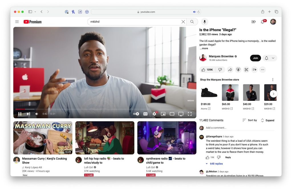 Image: @_brianhamilton on Threads
Have you seen the new YouTube design yet? Has it reverted for you? Let us know in the comments below.
More on YouTube:
- YouTube Music wants to be the ‘ultimate destination for podcasters and fans’
- Can you turn off YouTube’s invasive new TV screensaver?
- YouTube now supports 8K streaming on Meta Quest
Follow Ben: Twitter/X, Threads, and Instagram
FTC: We use income earning auto affiliate links. More.


![Would you ever pay to watch your favorite YouTube channel? [Poll]](https://i0.wp.com/9to5google.com/wp-content/uploads/sites/4/2019/09/youtube_101.jpg?resize=1200%2C628&quality=82&strip=all&ssl=1)


![How many hours of YouTube do you watch per week? [Poll]](https://i0.wp.com/9to5google.com/wp-content/uploads/sites/4/2023/09/youtube-android-1.jpg?resize=1200%2C628&quality=82&strip=all&ssl=1)


 English (US)